Premium Only Content
This video is only available to Rumble Premium subscribers. Subscribe to
enjoy exclusive content and ad-free viewing.

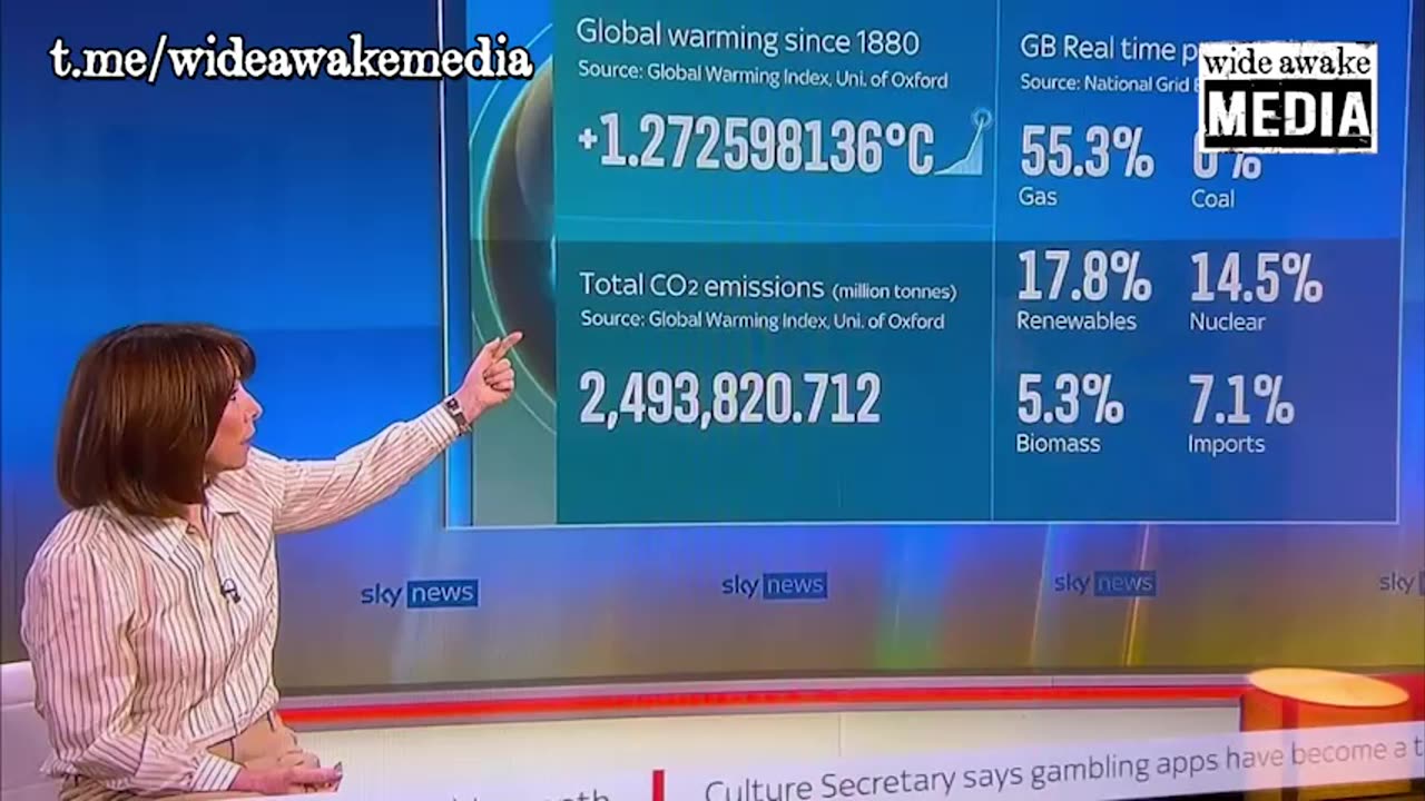
Climate crisis - sky news using climate doomsday graph
2 years ago
29
Remember the daily "Covid deaths" updates and graphs they used to scare people into believing in the Covid scam? Now they've started doing something similar for the climate scam. 🤡
I love how they added nine decimal places to the miniscule 1.27°C temperature rise, to make it look like a huge number.
And I love how they started in 1880, as if history started in 1880. If they'd started at the Medieval Warm Period, it would show a decline in temperature. 🤪
Loading comments...
-
 1:54:08
The Michelle Moore Show
18 hours ago'Medical Preparedness...Your Gateway to Freedom, Foods Parasites Hate, and more' Guest, Dr. Shawn Rowland, Founder of Jase Medical: The Michelle Moore Show (July 29, 2025)
12.2K8 -
 15:05
15:05
The Pascal Show
11 hours ago $0.01 earnedHOLY SH*T! The Missing Minute From Epstein’s Jail Video Has Been FOUND
5.53K3 -
 LIVE
LIVE
Lofi Girl
2 years agoSynthwave Radio 🌌 - beats to chill/game to
169 watching -
 2:14:32
Inverted World Live
8 hours agoHarvard Astronomer Says Hostile Alien Spaceship Heading Toward Earth | Ep. 82
220K50 -
 2:29:34
Brandon Gentile
4 days agoHow To Retire 10 Years Early with Just 0.1 Bitcoin
9.44K4 -
 3:19:34
Laura Loomer
8 hours agoEP135: Champagne Communism: Zohran Mamdani's Ugandan Compound EXPOSED
48.7K11 -
 28:39
28:39
The Why Files
3 days agoCryptids Vol. 4 | Bunyips, Yowie and Australian Nightmare Fuel
58K38 -
 1:07:06
Mike Rowe
18 days agoThe Fight For America's Heartland | Salena Zito #442 | The Way I Heard It
42.4K48 -
 2:43:30
TimcastIRL
8 hours agoSouth Park Goes FULL CHARLIE KIRK, Latest Episode ROASTS Trump Again | Timcast IRL
228K119 -
 7:15:38
SpartakusLIVE
9 hours agoThe Return of the KING of Content
58.2K