Real Estate Quick Logo Concept Process
J P Ramirez is a real estate company that offers professional and experienced services to its clients. The company is run by Jose Ramirez and Paola Cano, a couple that has been working in the real estate industry for over 16 years. They want to brand themselves as the real estate experts in their community, with high standards of professionalism and customer satisfaction. Their target audience is people who are looking for a reliable and trustworthy partner to buy or sell their properties.
The logo design should reflect the company’s values and personality, as well as its industry. The preferred colors are blues, light neutrals and dark neutrals, which convey maturity, sophistication, luxury and masculinity. The logo design should also incorporate both of their names or initials in a creative way that stands out and creates a memorable impression.
--------------
Connect With ME
http://www.youtube.com/c/CreativeJAC
https://twitter.com/CreativeJAC
https://www.facebook.com/CreativeJAC/
Thanks
CreativeJAC
-
 0:55
0:55
Funniii
10 months agoLogo design process of a construction company.
6 -
 25:30
25:30
Life Unboxed Blog | Momtrepreneur and Homeschool Mom
3 years agoThe Many Way to Create a Business Logo
17 -
 0:40
0:40
logodesignsingai
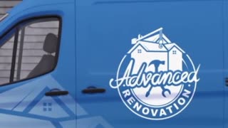
2 months agoLogo design serves as the visual cornerstone of a business brand identity. — Logo Design Singapore
1 -
 12:34
12:34
Benu Creative
1 year agoEverything You Need to Know About Fantastic Logo Design | Step-by-Step Guide
19 -
 0:59
0:59
JagaK
5 months agoI will design a unique 3d logo for your business
1 -
 0:40
0:40
logodesignsingai
2 months agoThrough a collaborative process, they understand the client’s brand identity,-Logo design Singapore
3 -
 2:57
2:57
Professional Graphics Designer
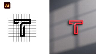
1 year agoT Logo Design | professional logo design in adobe illustrator | logo design process
2 -
 0:15
0:15
debbierex123
1 year agoHow to get a professional logo for your business.
4 -
 57:45
57:45
Robert Syslo Jr
1 year agoReal Estate Investors: A Talk on Branding and Advertising - Robert Syslo Jr
6 -
 6:16
6:16
PBS_OffBook
6 years agoThe Art of Logo Design
5