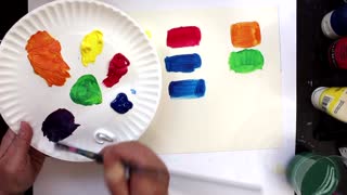
How to Exaggerate Color from a Black & White Photo / Marsh Painting Tutorial
1 year ago
1
I have discovered that by working from a Black and White reference image, I can get more creative with color and make color palette decisions I might not choose when working from a color photo. Often the resulting painting is more expressive and colors are more intensified. I find this technique is also an EXCELLENT way to see value which is actually more important than seeing color for creating better artwork.
Loading comments...
-
 7:54
7:54
Malcolm Dewey Fine Art
1 year agoDo Your Paintings Need RICHER Color?
12 -
 32:32
32:32
Stephanie Weaver Fine Art Artist
1 year agoColor Theory & Color Wheel: Color Mixing Without Creating Mud
4 -
 0:59
0:59
Malcolm Dewey Fine Art
1 year agoTop PAINTING Tips for Colorful Landscapes 🎨
6 -
 2:10
2:10
H.A.T. Academy
3 years agoMixing Colors with Paint
72 -
 6:50
6:50
Sword `n` Steele
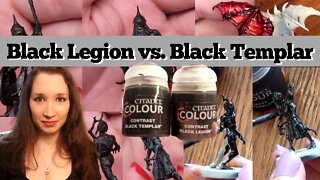
2 years agoBlack Legion & Black Templar - Contrast Paints Review
11 -
 1:20
1:20
Victoria Hagaman
1 year agoCOLORFUL SHADOWS: How to Keep Your Paintings Full of Color
2 -
 11:12
11:12
Malcolm Dewey Fine Art
3 years agoTry PAINTING a Reproduction of a Master Painting 🎨 (Oil Demo)
8 -
 20:44
20:44
Malcolm Dewey Fine Art
2 years agoWhy Your PAINT Colors are Not Vibrant 🎨 (How to Fix It)
4 -
 4:45
4:45
Victoria Hagaman
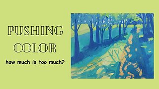
9 months agoPUSHING COLOR IN A PAINTING: Was This Too Much?
7 -
 13:15
13:15
Malcolm Dewey Fine Art
1 year agoMastering Impressionist PAINTING Techniques: Part 3 - The Power of Color and Light
43