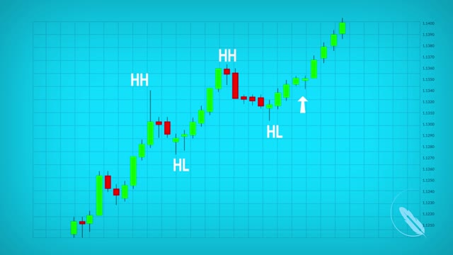
Chart Types
A chart is simply a visual representation of a currency pairs price over a set period of time. Let's take a look at the 3 most popular types of price charts.
1: Line
2: Bar chart.
3: Candlestick chart.
Line charts are drawn by simply connecting one closing price to the next closing price in one single line. The main advantage of this type of chart is that it's extremely clean that it filters out a lot of market noise.
A bar chart is a little more complex it shows the opening and closing prices as well as the highs and lows. The horizontal line on the left shows the opening price, the bottom of the vertical line shows the lowest price for that specific time. The horizontal price on the right shows the closing price while the top of the vertical line shows the highest price for that specific time.
The candle stick chart is a variation of the bar chart. Candlestick charts show the same price information as a bar chart but in a prettier graphic format. The larger blocks in the middle are called bodies. The vertical lines above the body are called the upper shadow. The vertical lines below the body are called lower shadows. Green body candles indicate that the currency closes above the opening price. Red body candles indicate that the currency closes below the opening price. Candlesticks are easy to interpret and are a good place for beginners to start figuring out forex chart analysis.
-
 56:18
56:18
Tucker Carlson
2 hours agoSam Altman on God, Elon Musk and the Mysterious Death of His Former Employee
14.5K57 -
 1:12:40
Sean Unpaved
3 hours agoJalen Carter's 1-Game Suspension & The Pressure for Instant Greatness in Sports
16.8K2 -
 1:07:27
LindellTV
1 hour agoBREAKING: MICHIGAN JUDGE THROWS OUT CRIMINAL CHARGES
3.39K3 -
 11:34
11:34
The Kevin Trudeau Show Limitless
5 hours agoClassified File 4 | The Hidden Science of Brain Control REVEALED!
3174 -
 17:22
17:22
Silver Dragons
2 hours agoDealer Reveals Best SILVER to Buy on a TIGHT Budget
344 -
 4:07
4:07
Michael Heaver
8 hours agoFrance Absolutely IMPLODING Under Macron
2051 -
 27:54
27:54
The Boomer Effect
3 hours agoHealth Freedom & Silver Science: Disrupting the System
101 -
 2:23:39
Steven Crowder
6 hours agoIryna Zarutska Was Failed - And We Won't Forget Who Did It
321K476 -
 1:06:44
Timcast
3 hours agoNATO Article 4 INVOKED Over Russian Incursion Into Poland, Drones SHOT DOWN, War FEARED
118K152 -
 1:57:42
The Charlie Kirk Show
3 hours agoWe Don’t Have To Live This Way + The Death of Britain | Emmons, Shirley, Prof. Orr | 9.10.2025
40.6K33