Information cannot be judged without understanding the meaning of the scale
3 years ago
6.96K
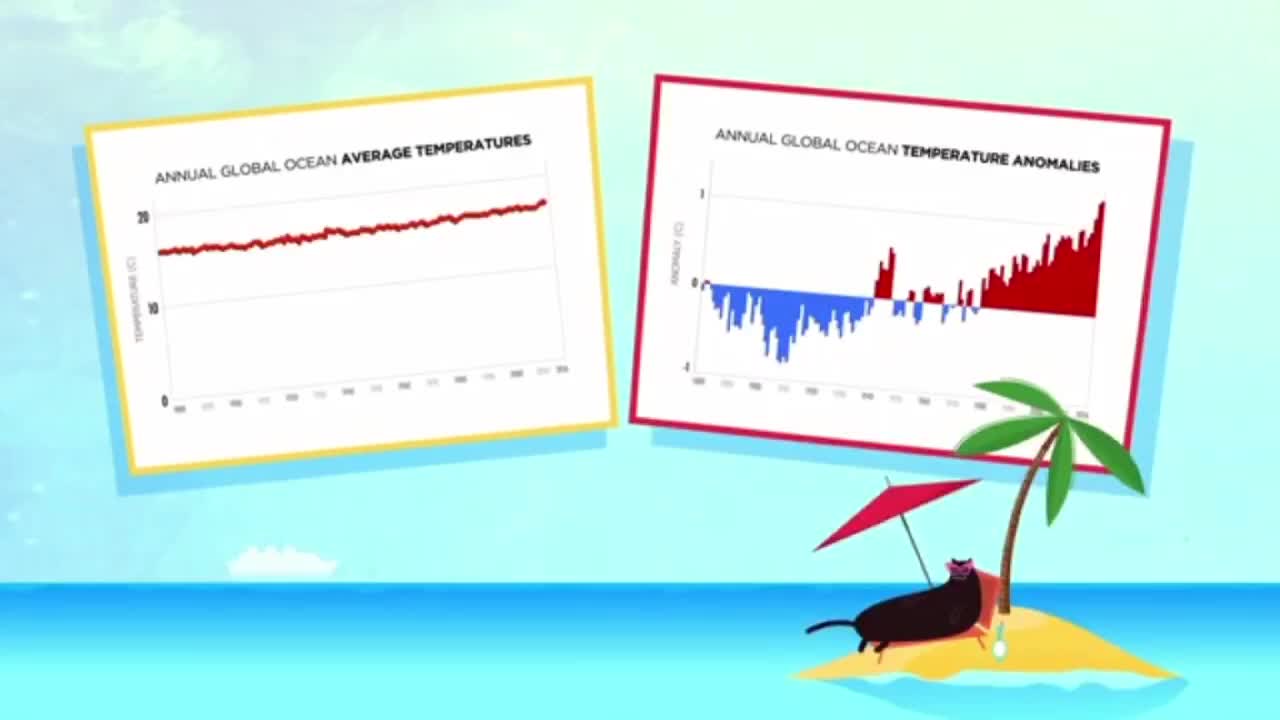
Finally, a graph can't tell you much if you don't know the full significance of what's being presented.Both of the following graphs use the same ocean temperature data from the National Centers for Environmental Information.So why do they seem to give opposite impressions?The first graph plots the average annual ocean temperature from 1880 to 2016,making the change look insignificant.But in fact, a rise of even half a degree Celsius can cause massive ecological disruption.This is why the second graph,which show the average temperature variation each year,is far more significant.
Loading comments...
-
 LIVE
LIVE
Dr Disrespect
1 hour ago🔴LIVE - DR DISRESPECT - ARENA BREAKOUT: INFINITE - STORM EVENT
1,282 watching -
 LIVE
LIVE
Lara Logan
11 hours agoTHE REMNANT RISES: Matt Shea & The New Generation of Pastors on Fire for God & Country | Episode 37
155 watching -
 LIVE
LIVE
Nikko Ortiz
3 hours agoADHD, Crashouts, and Karens - Rumble LIVE
270 watching -
 49:21
49:21
Steven Crowder
3 hours agoWhy She's Wrong and other Life Advice from Steven Crowder
151K90 -
 48:24
48:24
The Rubin Report
2 hours agoPress Stunned by Trump’s Brutally Honest Reaction to James Comey Question
28.6K8 -
 1:02:42
VINCE
4 hours agoComey Indicted, Soros Exposed: The Powder Keg Just Exploded | Episode 134 - 09/26/25
216K225 -
 DVR
DVR
Bannons War Room
7 months agoWarRoom Live
38.3M8.88K -
 1:45:34
Benny Johnson
3 hours ago🚨James Comey INDICTED for Perjury and Obstruction, Years In JAIL | 275 FEDS in January 6th Crowd
60.2K76 -
 1:35:48
Dear America
4 hours agoBOMBSHELL: 274+ Feds Where in The Crowd On Jan 6th!! + James Comey Finally INDICTED!!
142K103 -
 1:55:16
Badlands Media
8 hours agoBadlands Daily: September 26, 2025
51.6K16