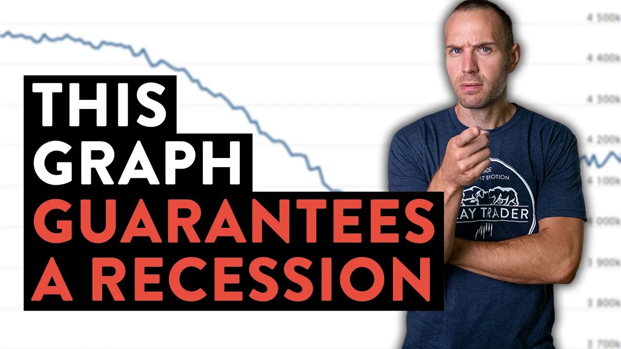
This Graph Guarantees a Painful Recession… (maybe Depression?)
It amazes me how the mainstream financial media overlooks such basic graphs that illustrate such powerful topics of consideration. Unfortunately, the graph I will show you in this video guarantees a painful recession (if not a depression!). Oftentimes the best predictor of the future is looking backwards into history. I realize that past history does not guarantee future results; however, when you consider the context of the last time in history a balance sheet reduction occurred and combine that with the current state of affairs… uh oh! I don’t mean to be so pessimistic, but it’s hard to be positive when all the data is staring you in the face screaming, “be ready for pain!”. You don’t need to be an economist to analyze this graph and see all the red flags it presents to our current economic conditions. Inflation is a massive problem and needs to be fixed. Will the federal reserve do what it promises to do? This graph suggests, if they do… it’s gonna be painful!
Monitor the Chart for Yourself: https://www.federalreserve.gov/monetarypolicy/bst_recenttrends.htm
This Free Event Reveals: How I transformed myself from an employee to my own boss (and how you can too, even with no experience!). Register: https://claytrader.com/1-hour-trader-transformation/?utm_source=social&utm_medium=youtube
Enjoy this Free Content? I'm confident you'd enjoy my premium training courses then: https://claytrader.com/training/?utm_source=social&utm_medium=youtube
Hear real-life trading journeys from "normal" people: The Stock Trading Reality Podcast - https://claytrader.com/podcast/?utm_source=social&utm_medium=youtube
Pick up some ClayTrader gear at https://daytradergear.com/?utm_source=social&utm_medium=youtube
-
 11:07
11:07
Clay Trader
1 year agoMy Balanced Approach to Taking Profits in a Day Trade (Data Driven Example)
85 -
 LIVE
LIVE
The Mel K Show
1 hour agoMORNINGS WITH MEL K -This Labor Day Celebrate Liberty, Freedom & Family! 8-29-25
464 watching -
 LIVE
LIVE
The Shannon Joy Show
2 hours ago🔥🔥The Butchers At Hilo Benioff Hospital Hawaii - Mom Subjected To Forced C-Section & Abuse🔥🔥
277 watching -
 LIVE
LIVE
LFA TV
5 hours agoLFA TV ALL DAY STREAM - FRIDAY 8/29/25
4,232 watching -
 LIVE
LIVE
Grant Stinchfield
19 hours agoEven DC’s Homeless Beg for Trump’s Law & Order — While Wacky White Liberal Women Scream NO!
153 watching -
 1:02:30
VINCE
3 hours agoGavin Newsom Is A Major Trump Fan | Episode 114 - 08/29/25
141K109 -
 1:32:10
Nikko Ortiz
3 hours agoPainful Life Experiences
17.2K7 -
 1:42:16
Dear America
4 hours agoThe Left Chooses TRANS Over Christianity!! WOKE Mayor Is Doubling Down!!
88.1K54 -
 LIVE
LIVE
Caleb Hammer
2 hours agoGaslighting. Toxic. B*tch. | Financial Audit
92 watching -
 LIVE
LIVE
Viss
2 hours ago🔴LIVE - Positioning, Tactics, Strategy How To PUBG! - PUBG 101
103 watching